Magazine Conventions
|
|
|
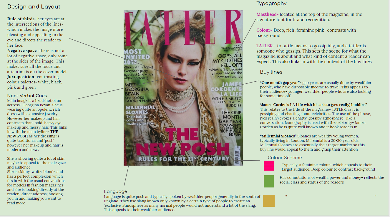
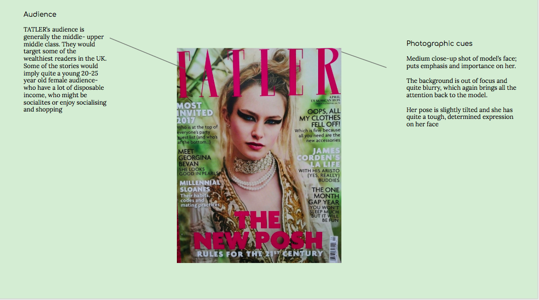
magazine- analysis- TATLER
Conde Nast
- Tatler is published by Conde Nast publications- an American mass media company
- Conde Nast was formed in 1892, with the creation of Vogue.
- Conde Nast also publishes some of the biggest magazines in the world: Glamour, Vogue, Vanity Fair, the New Yorker and GQ.
- It is generally considered to be the originator of the class publication- where the magazine is targeted towards a social class or a particular interest- instead of targeting the largest possible audience. This links in with the particular audience TATLER targets and magazines such as Conde Nast traveller also target specific interests such as travel and holidays.
- Its magazines have a wide range of subjects- food, travel, home and culture but the majority are about fashion.
- in 2011, they launched Conde Nast entertainment to develop film, television and digital video programming
-
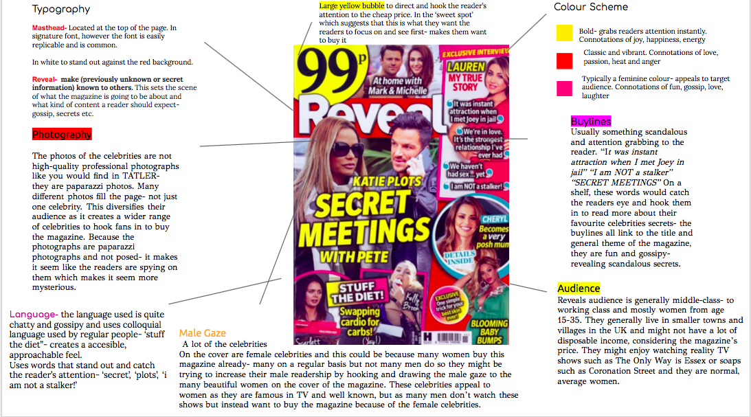
REVEAL magazine
- "Reveal is the reader's best friend; fun, gossipy and full of advice on everything from fashion and beauty to diets and lifestyle"-Reveal's description of itself
- Reveal is owned by Hearst- a British magazine company
- 50% of the readers are generally middle class or above and 50% are working class or below
- Readers are generally women from 13 to 35. Over 35s dont read the magazine that much as they most likely have kids and are busy
- Younger people are more likely to buy this as they are more likely to watch reality TV shows and be up to date with news and gossip.
- Not many readers in Central London- rich, upper- class: more likely to read high-end magazines.
- Not many readers in Scotland- rural community
- Most of the readers are from the rest of the UK, small villages and towns
- The colour pallete is bright, feminine colors
- Anchorage text in bright yellow to grab attention
- Bold fonts
- Magazine cover is very crowded with lots of images- looks quite cheap.
- Main image of the main story surrounded by smaller images and text- almost like buy lines with images
Hearst
- REVEAL is published by Hearst UK a Britsh mass media company based in London.
- It publishes magazines such as ELLE, Harper’s Bazaar, Cosmopolitan and Good Housekeeping.
- They sell over four million magazines a month
- They have three other 'gossip' type magazines- Inside Soap, Best and Real People
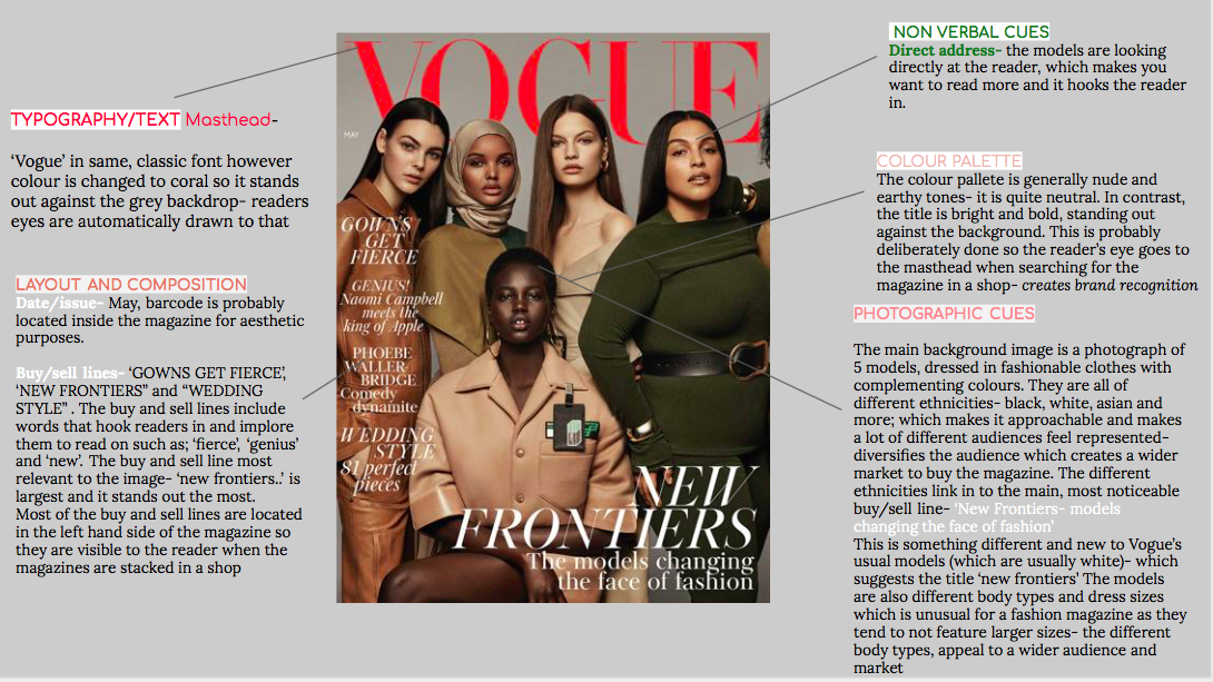
VOGUE- analysis
production work- my magazine
Audience
I think the audience for my magazine would be of the social class of A (upper middle class), B( middle class) or C1 ( skilled working class). This is because the magazine would be quite expensive- more expensive than a magazine such as Reveal but less expensive than a magazine such as Tatler- it would be a mid range price. The people who buy this magazine should have some disposable income to buy the magazine and enjoy quite a wealthy lifestyle as a lot of the fashion included in the magazine will be mixed- high-street brands with high end brands so it is accessible and relatable for most people.
Production work
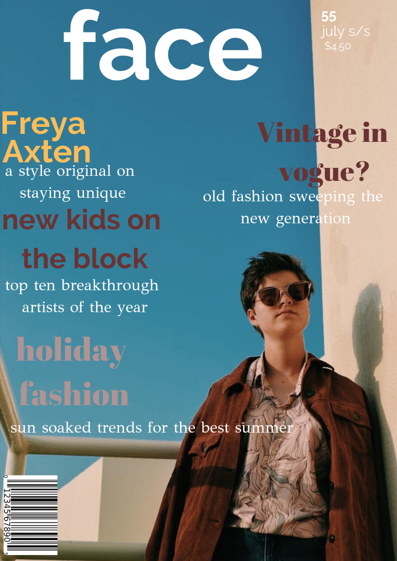
My cover model is wearing quite unisex clothes- although the magazine is mainly targeted towards women, it would appeal to men as well because its not just fashion it covers all aspects- lifestyle, music, pop culture etc. Because of this, the magazine doesn't just seem specifically tailored to women by being girly and feminine- it can be for anyone which widens my audience. Additionally, the clothing is a mix of popular clothing such as jeans which appeal to an 'aspirer' and the model also is also wearing some unique, different pieces of clothing which would appeal to a radicalist.
I didn't choose a shot with direct address as I wanted to create a narrative through the cover and this is further re- inforced by the unique clothing and the sunglasses that the model is wearing. This could hook potential readers in as it looks quite cool and mysterious, making them want to pick up the magazine and read on.
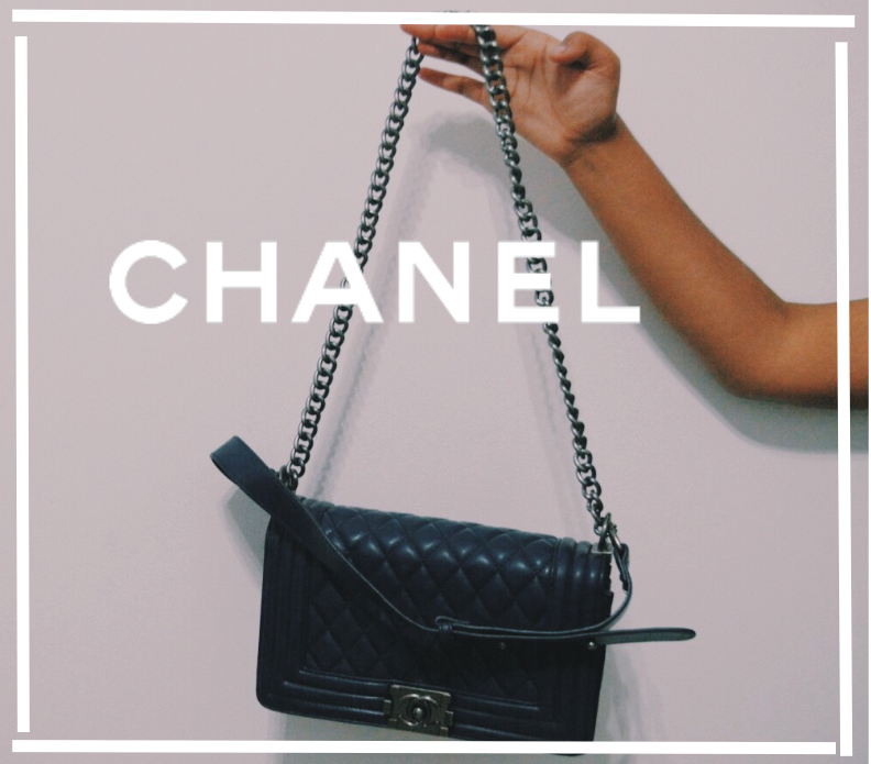
For my advert, i chose to advertise a high-end brand- Chanel. This was because i feel like it is a really well- known, classic brand that would appeal to everyone. By choosing a high end brand to advertise, this makes it seem more appealing to aspirers, as it is on trend and quite expensive and the brand would make them seem fashionable and trendy, or succeeders, as it is a classic, reliable brand that gives the wearer some power and influence
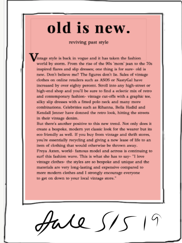
For my article, I chose to write about the topic of vintage fashion as I felt that it would be quite interesting as a lot of people are becoming more interested in it. Also, the topic is also a mix of fashion and lifestyle which fitted in perfectly with my magazine as it is not just a fashion magazine but a mix of fashion, lifestyle. etc. I thought that the article would stand out and be quite different as a lot of articles in fashion magazines generally focus on makeup, runway fashion or upcoming trends.
As vintage fashion can be for everyone it would appeal to most social classes as it can be expensive and also quite cheap, which widens my audience. Also as it is quite eco-friendly it would appeal to a 'carer'
Production work
My cover model is wearing quite unisex clothes- although the magazine is mainly targeted towards women, it would appeal to men as well because its not just fashion it covers all aspects- lifestyle, music, pop culture etc. Because of this, the magazine doesn't just seem specifically tailored to women by being girly and feminine- it can be for anyone which widens my audience. Additionally, the clothing is a mix of popular clothing such as jeans which appeal to an 'aspirer' and the model also is also wearing some unique, different pieces of clothing which would appeal to a radicalist.
I didn't choose a shot with direct address as I wanted to create a narrative through the cover and this is further re- inforced by the unique clothing and the sunglasses that the model is wearing. This could hook potential readers in as it looks quite cool and mysterious, making them want to pick up the magazine and read on.
For my advert, i chose to advertise a high-end brand- Chanel. This was because i feel like it is a really well- known, classic brand that would appeal to everyone. By choosing a high end brand to advertise, this makes it seem more appealing to aspirers, as it is on trend and quite expensive and the brand would make them seem fashionable and trendy, or succeeders, as it is a classic, reliable brand that gives the wearer some power and influence
For my article, I chose to write about the topic of vintage fashion as I felt that it would be quite interesting as a lot of people are becoming more interested in it. Also, the topic is also a mix of fashion and lifestyle which fitted in perfectly with my magazine as it is not just a fashion magazine but a mix of fashion, lifestyle. etc. I thought that the article would stand out and be quite different as a lot of articles in fashion magazines generally focus on makeup, runway fashion or upcoming trends.
As vintage fashion can be for everyone it would appeal to most social classes as it can be expensive and also quite cheap, which widens my audience. Also as it is quite eco-friendly it would appeal to a 'carer'
What would I do to improve?
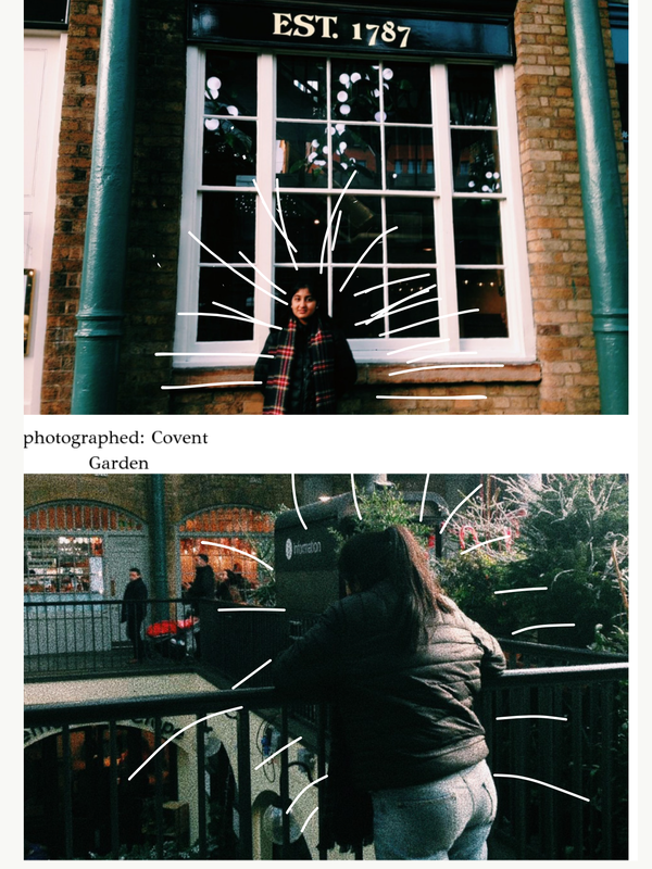
To improve my article, I would definitely write some more as I dont feel like there is enough content to call it an article. For the photographs to go with my article, i would plan a proper photoshoot as when i took these photos it was really rushed and quick and i didnt get many shots so i had to work with what i had- if i could do it again I would be more picky in choosing which photos to use an where to make sure my front cover matched the article and photography.
To improve, i'm probably going to write more to go in the article and also shoot more photos to go in as mine are a bit rushed and all over the place.
To improve, i'm probably going to write more to go in the article and also shoot more photos to go in as mine are a bit rushed and all over the place.
